To eat or not to eat
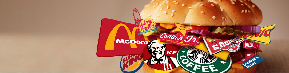
Today we’ll continue our color talk but in a more specific way. We want to tell you about fast food branding and color style. Just take a look on popular fast food companies – their products are quick to get and they cost much less then good restaurants, however they have bright and sometimes much more expensive logos or they just look like that.
For example, McDonald’s logo was created in 1951 and costs only 30 dollars.
Have you ever paid any attention to the fact that color is a determining option of your favorite brand logo? Food&Color talk: you decided to open fast food restaurant, so we are here to give you some important tips of color solutions, to avoid repelling of your future customers. You have to understand that some colors can make you hungry, but some of them can make you seek.
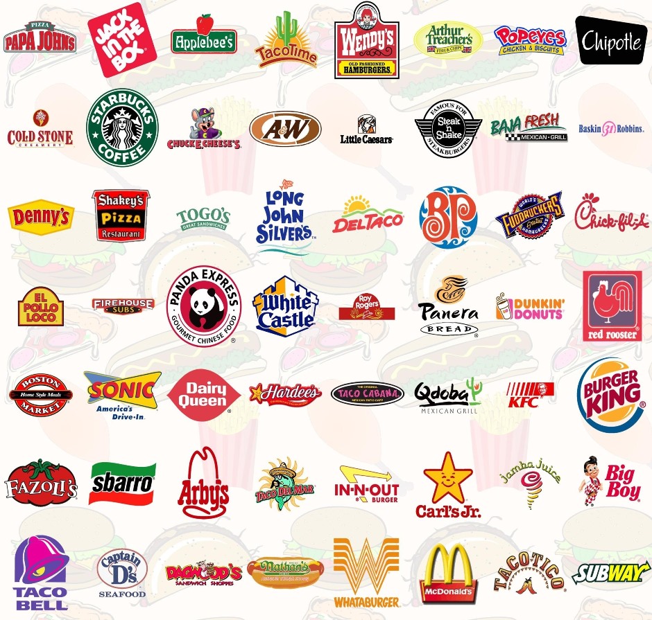
Just take a look on all this fast food logos – what you see?
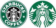
Most of them have the same color range - red, yellow, orange, pink – these color solutions can bring you much more clients.
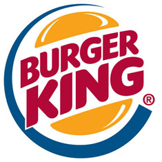
McDonalds, KFC, Burger King, and many other successful fast food networks chose red and yellow colors for their logo, as well as for decoration. The label on the packages must also have these colors. The red color is very emotionally intense and energetic. It increases respiration rate and raises blood pressure, also it stimulates the appetite. By the way, we recommend using this color scheme in the kitchens and dining rooms unless you try to lose weight.
Remember that on the plastic or paper bag in which you’ll pack your products must have a big sticker with your company name, logo, phone number or address. It is necessary to choose the right colors for that too, as well as the right logo colors. There are certain tones that can make you really hungry or cause you an aversion to food. What else can we say about the logo color?
It certainly must be orange, yellow, red or turquoise.
Let us find out why:
Orange increases oxygen supplied to the brain, has an invigorating effect and stimulates mental activity. This color increases appetite, energizes, and even promotes the absorption of calcium! Therefore, the researchers recommend feed your naughty kids from the orange dishes, or put on orange clothes while talking to them. This warm and friendly color makes people feel more comfortable near you.
Yellow color, according to the British doctors, stimulates the nervous and digestive systems. Also this bright tone can make a good contribution to the developing of logical thinking.
Turquoise or blue - stimulates the appetite. If you combine orange and turquoise shades you will create so-called - "tasty" brand. If you hang a picture of these colors in the kitchen and watch them while eating, you quickly get rid of excessive thinness.
So, now you know the colors which can stimulate the appetite, so you need to learn what colors should be avoided in fast food logo design
Please don’t use gray and green colors.
Light-blue color is the color of peace, logic, and rest. It will act like a perfect appetite suppressant. You really don’t need this.
Green - associates with nature and symbolize health. And here you can see the connection between this color and nature – it can give you a good relaxing effect - which again dulls your appetite. But using this color on nonfood products will bring you a sense of confidence in the product.
Grey - muffles appetite and can even disgust it! It doesn’t cause irritation, but it soothes and mutes anxiety and the appetite too.
The color is one of the most important aspects of your future logo; it can look pure, awesome and rich or can make people awkward, sick and even disgusting. Be careful when making choice.
Share


